|
In as many areas as possible, we would like Mahalo to be creative and unique (not to mention fun). When we saw the awesome work Seattle based Reid Signs (www.reidsigns.com) had done with other Hamptons transom lettering we were stoked! We looked at a lot of fonts and couldn't agree on a single font. So we showed Chris of Reid Signs what we liked about several, and he hand built the letters for us. 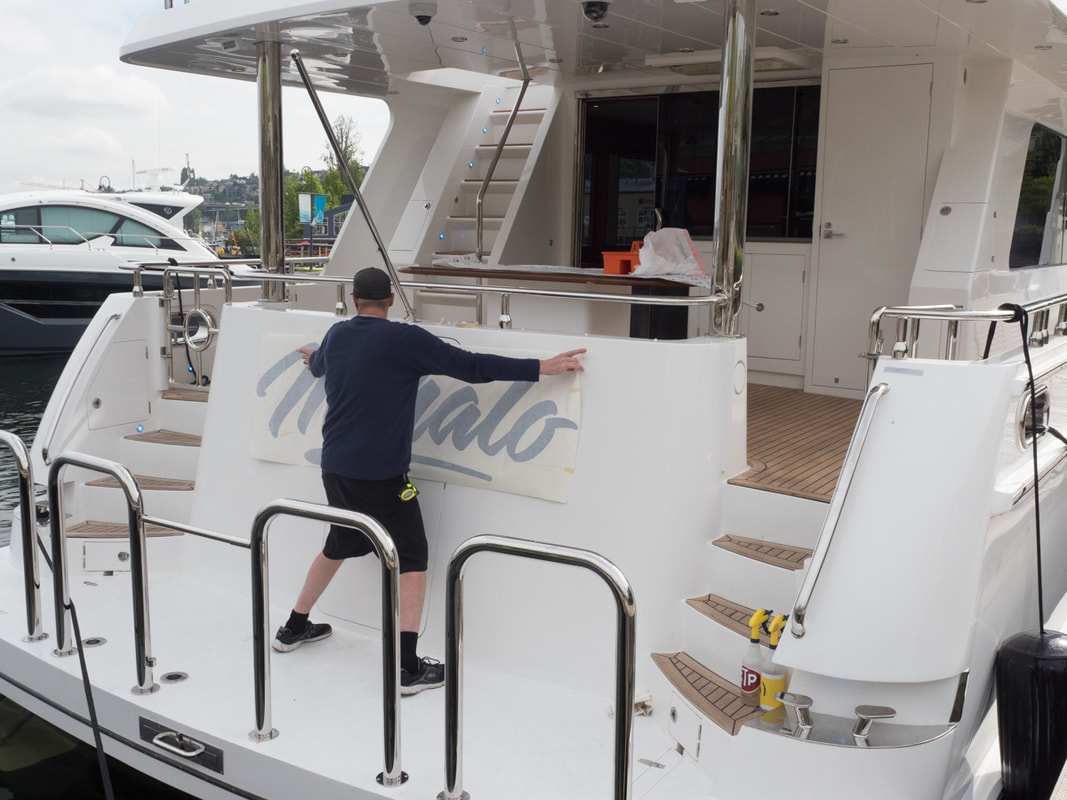 Along the same time as we were doing the design, 3M came out with some new media. It's like that mega expensive car paint that changes color depending on the sun angle and your POV. 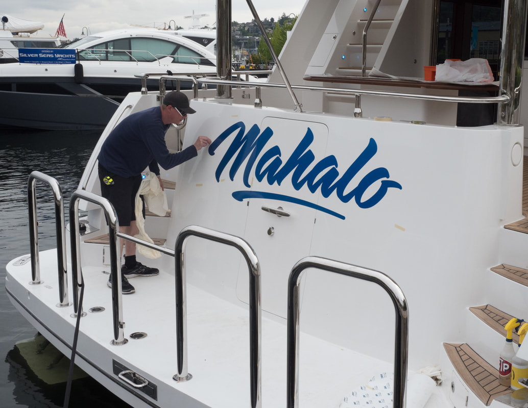 Looks pretty awesome, right? BWTM (But Wait There's More). This blue is the base layer. 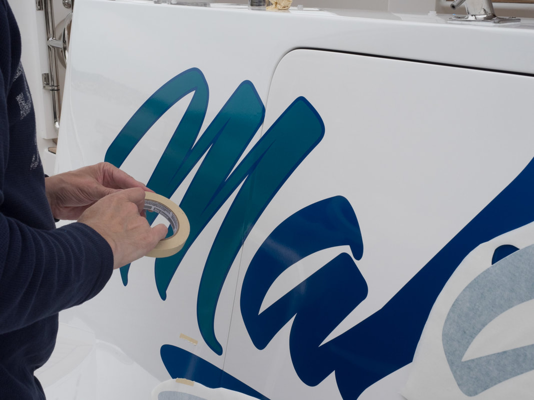 The blue layer becomes the outline of each letter, as the green layer is applied. So green is the main color. It would also look good the other way, with blue in the middle and a green outline. But I let Deb win this one. 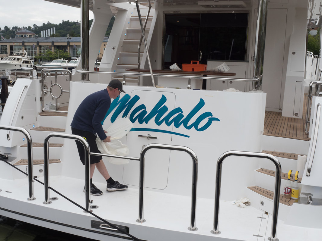 The interaction between this media and digital cameras is interesting. When Chris previously brought some samples to the boat, I tried photographing them with my phone and it just couldn't render what we were seeing with our eyes. Here I'm using my real camera, which does a better job. Looking good, right? BWTM. 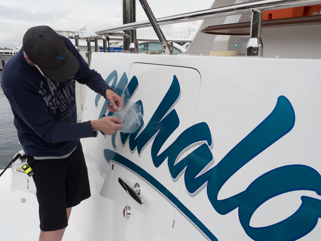 Drop shadows! 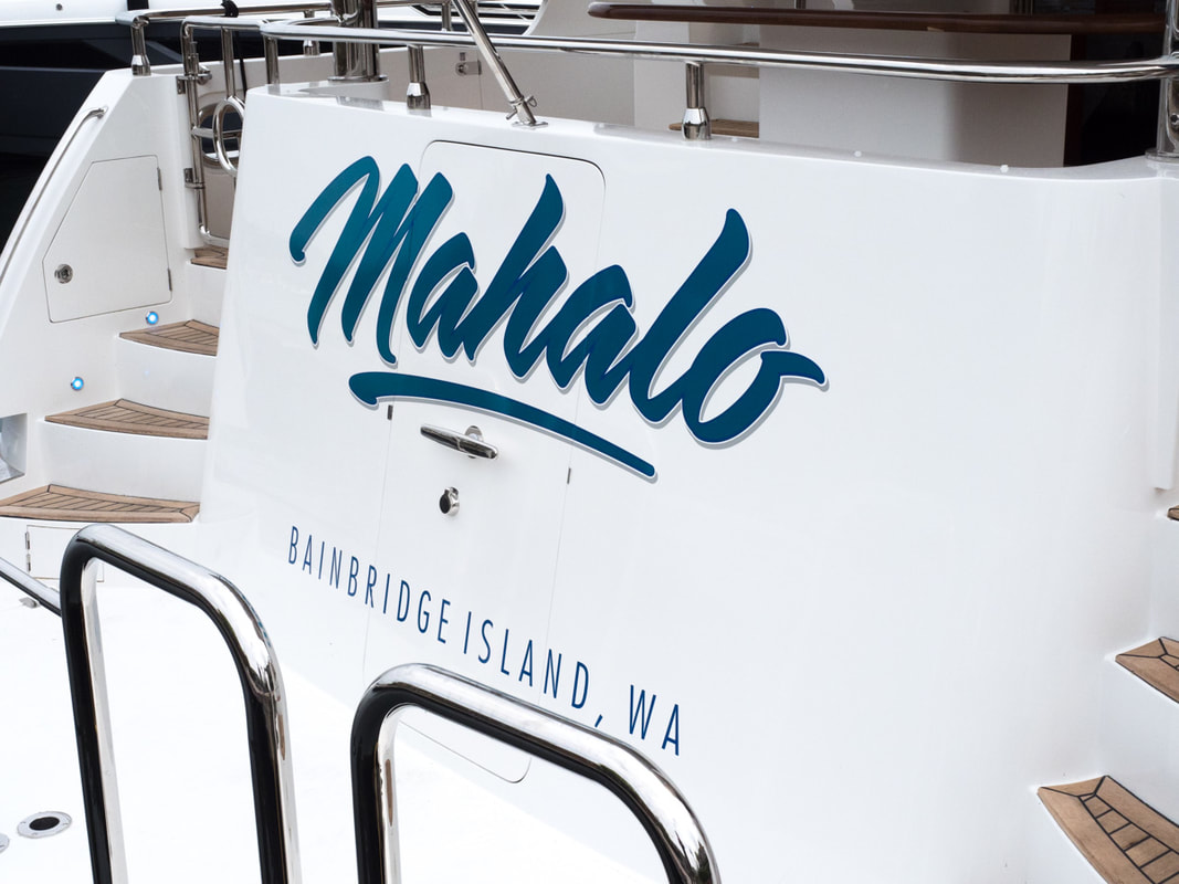 HYG Seattle has a slew of great service providers. We are really pleased with Reid Signs and I personally want to thank Chris for his awesome work. (BWTM but that is for another blog post!)
0 Comments
Your comment will be posted after it is approved.
Leave a Reply. |
Archives
January 2020
Categories
All
|
 RSS Feed